Introducing the Urbal map
Written by: Tom Bliss, Leeds Beckett University, 08/03/2016
Why ‘Urbal’?
There is a term, ‘Rurban,’ which technically describes a ‘periurban’ area that is chiefly residential, but where some farming is carried out. It’s also used by some to describe the bleeding of unsustainable and polluting urban consumerism into formerly healthy rural resources. (It’s even been claimed that the whole of Britain is now effectively Rurban).
So in my film The Urbal Fix, which offsets the pre-car theories of my ancestor Ebenezer Howard with CPUL theory, I coined a polar opposite, ‘Urbal,’ to describe the injection of countryside – or, more specifically, multifunctional green space (providing ecosystem services), green productivity (especially food growing), and general ‘green’ thinking – deep into the heart of our cities. (It’s also a nice pun).
Why a map?
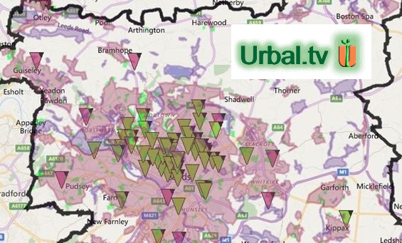
I’m a landscape architect by training, and I currently teach this and urban design at Leeds Beckett University, while also working at the University of Leeds with the United Bank of Carbon (which means trees, in case you hadn’t guessed). So I’m accustomed to thinking graphically and spatially. Maps tell us where things are, or more specifically, how distant they are from each other – and from us, if we’re inside the area described. And today we have online maps, which let you zoom from metropolitan scale (to explore how a city works as a single economy, organism or ecosystem) to street scale (to find out what’s happening near you), at the flick of a mouse wheel.
Why only Leeds?
We’re ultimately trying to map Leeds City Region, which is the closest administrative boundary fit with the ecosystem of this conurbation. (Investigating where different city boundaries should be defined is in fact one of our core research questions). But initially it makes sense largely to limit research to the Leeds Metropolitan District, so that our data can more easily be compared with data collected by others.
Why so many layers?
I have a fascination with the ‘layer-cake’ methodology of the pioneering landscape architect and planner Ian McHarg (1921-2001), who believed communities and ecology should be enmeshed. He urged landscape planners to conform to ecology, not compete with it, and promoted his Ecological Inventory, which uses overlays to map climate, geology, hydrology, soils, topography, vegetation, wildlife and more, and so inform how settlements should best be developed. But doing this online with a city the size and complexity of Leeds was going to be a challenge.
Then I noticed Bill Phelps’ lovely Mappiness and asked him if I could adapt and develop it to suit my purpose, but I was plainly going to swamp his modest experiment, so with his blessing I started on my own, (or rather we did – I would have never got beyond one badly organised layer on Google Earth without my expert programmer son, Jack). It worked. An online map proved to be an excellent way to show McHarg’s and many more layers in a sharable and switchable form which encouraged users to interrogate how different environments and functions influence, inhibit or provide opportunities for each other and the city as a whole.
So how many layers do we need? Well, we still don’t have all of McHarg’s layers on board, because we’ve not found a way to import stone age JPEGs (we can import kmls and xlms though), and we’ve had limited time for manually copying background data click by click by click. Also, people keep asking for more layers – and if they make a good case, we’re happy to oblige. Size is not a problem because we can make subset maps for individual projects like this.
Why crowd-sourced?
This project has to date been self-funded. I could apply for some grant to allow me to hire a zillion mappadrones, but grants come with strings – and I tend to get tangled in strings. There are 750,000 local experts out there in Leeds – in fact anyone can contribute from anywhere around the world. And best of all; I have to pay none of you! More importantly perhaps, crowd-sourcing is the ideal way to provide a level of public ownership for the map.
We therefore created, at the top, a group of Guest layers with fairly simple propositions, and relatively easy access to encourage participation. We didn’t feel it was wise, however, to let people start just clicking away without even reading the instructions. We might get a lot of random entries. So we set up a generic ‘Guest / Me’ log-in, which allows people to contribute relatively easily.
But of course a generic log-in means we can’t track users to verify entries, so the data on Guest layers is, of necessity, suspect – and we encourage viewers to recognise this. However, we don’t want the whole map to be suspect. So we monitor Guest entries, and if we believe them to be sound, we move or copy them to an equivalent Member layer, where viewers can have more faith in their veracity. (The map is dead smart at moving and copying entries from layer to layer). Members can also add directly to Member layers.
Additionally, there are Research layers, which are not visible to the general public (usually because they contain work in progress), and also Personal pin and shape layers for each Member, where you can practice in private, or keep rough work without having to worry about the world watching on.
Why Bing?
Jack initially built the Urbal Map in the Google API, but then he discovered a potential copyright clash in an on-going dispute between Google and the Ordnance Survey over derived data. So he rebuilt the whole thing manually in the Bing API, which meant creating functions found in Google but not Bing, such as an ability to redraw shapes.
What’s different?
There are several unusual features. First, an ability to add and Hide information you’re not sure about, so we can research it but it’s not on public display. Second, when you locate a food outlet, it adds a transparent disc 1000m across, because research suggests that no-one should live more than 500m from a place where they can buy fresh fruit and veg – something we’re very interested in at Feed Leeds. (And we’re doing something similar to find houses more than 300m from 2 hectares of green space – as per the Natural England ‘Standards for Accessible Natural Greenspace‘ guidelines (2009) something we’re interested in at the Leeds Parks Forum).
The Table – which lets you see all the entries in a layer as a list is rare, but our Linked Entry feature is probably unique. We had a frequent challenge where different entries for the same project or organisation needed be added to different layers, so we could show the spread of different functions across the city – layer by layer. Switching on, for example, the Schools With Livestock layer would show the distribution of school animals at a glance – but it would not tell you that some of those schools also grew veg, held RHS Level 5, or owned a wind turbine. You’d have to switch on the correct other layers to find that – but, short of examining every layer at every visit, you’d never know which ones to try. There was a real risk that people would miss important data – which kind of negated the whole point of the map.
Jack’s brilliant solution was Linked Entries: Click any link in the Table, and a list of all the other entries linked to the one you clicked drops down. You can browse these at will, and easily drop back onto the map in a new layer, to find a different linked entry. Proud Dad.
Why no commercial use?
Two reasons: Being crowd-sourced, the Urbal Map is a continual ‘work in progress’ that’s constantly being added to and edited – and that information is inevitably going to go out of date later if not sooner. I certainly wouldn’t advise anyone to build a business plan around it!
The Urbal project is more about providing pointers and discussion topics than delivering hard data – though many entries are in fact reliable and will probably remain so. It’s for getting people to think differently about how the city might and indeed should be organised. It helps people and projects to find resources and each other, and it provides (or will provide, once the data becomes quorate) useful ball park totals – in real time. A level of inaccuracy does nothing to damage the core values of the map, even if it does minimise the value for commercial purposes.
However, the more pressing reason is that we made an early decision to publish the map under the ‘Attribution Non Commercial Share Alike’ Creative Commons licence – so all the data added thus far has been on that understanding. And many would probably not have contributed if it had not been so. Frankly, we couldn’t change it now if we wanted to.
So what’s next?
Well, we do have some ideas – but I’ve droned on for quite long enough. Let’s hear your ideas first :-)